The New U(I).
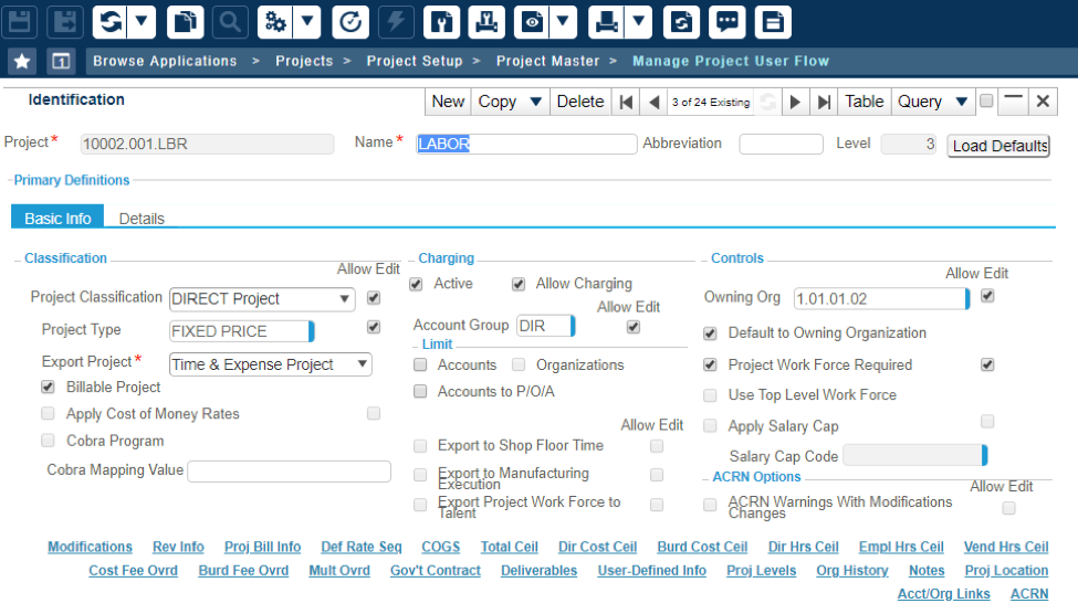
Times are changing, in the fast-paced world of software, apps and mobile, all software companies are in a race against time to roll out new features and functionality. What sometimes gets overlooked is the actual User Interface (the look) of the screens you work in.
Changing the user experience can be tough because everyone grows accustomed and attached to the look and where things are in the application. A perfect example is Microsoft Office, for those of you that have been through one of those upgrades, this is when all your icons go “missing” yet they are not, in fact, missing, just not where you remember them being last.
Costpoint, Time Collection, and Budget & Planning are now in that same boat. Some say its overdue, but in reality, it’s just time, time for Costpoint to have a fresh look.

First, a few things you need to know.
Over the last couple of years, Deltek has been migrating both Time, Expense & Employee Self Service, along with Budget and Planning into the framework, meaning that you now will have only one login screen to access all your functionality. So, for those of you that have yet to make that change, it is something you will want to consider first, this comes with a set of security roles and conceptual changes you need to make so that everyone can comfortably login to Costpoint, and have the proper security roles to access the applications that they need to complete their jobs.
For those of you that have already completed this, the new User Interface (UI) should be a breeze. Deltek took this task on in a different way; rather than bundling a whole bunch of new functionality and relocating all your application screens while changing the look to the product, they have separated the tasks. This is great for your T&E users.
For your T&E users, they are really looking at a color scheme change on the timesheet and a cleaner UI for expense reports. However, none of the locations or steps needs to complete a timecard have changed. This is a good thing for the users, while future updates will include enhancements for the user, the UI change will be just that and NOT an exercise in re-training.
However, if you are the type that buys a new recliner but places it next to the old one, rather than tossing out the old one, Deltek has you covered. Upon login, you may toggle between the old and new UI for the time being, allowing you to get comfortable slowly.

For those of you in the cloud, look for this change to occur in September, for those of you hosting your own versions of Costpoint, this functionality is already available for download. Deltek hosted a town hall to discuss this on September 6th and has released various new UI videos, infographics, and knowledge base articles to assist in the transformation. As always, let us know if you have questions or comments.
See you in November, in Dallas,
Martin McGann, Founder of PCI
